Followers

Sunday, September 30, 2012

CDAC Challenge Series

Happy Fall, everyone!!

I have two very different cards for you today.  We recently started a new Progressive Challenge series at the Crafter's Digital Arts Center, and I'm already behind in showing my cards to you.  If you're not familiar with these challenges, do be sure to click on the link and check out the site.  There are lots of fun activities for digital artists.  In the Progressive Challenge Group, we are currently on challenge 20, but I will show you the card for challenge 19 first.

Since summer was coming to an end, our challenge leader wanted to celebrate the summer season.  We had a fun surfboard digi image from Tiffany Doodles.  I hope you like what I've done with it; I turned mine into a 'feel better' card.


I decided to keep the card fairly simple and used coordinating design papers to paper-piece the surfboards, and I used a 'sandy' colored paper with a bit of inking to add a little dimension and shadow.  I made up the the outside sentiment, printed it and affixed it with foam tape putting a bit of curl into it for fun.
 
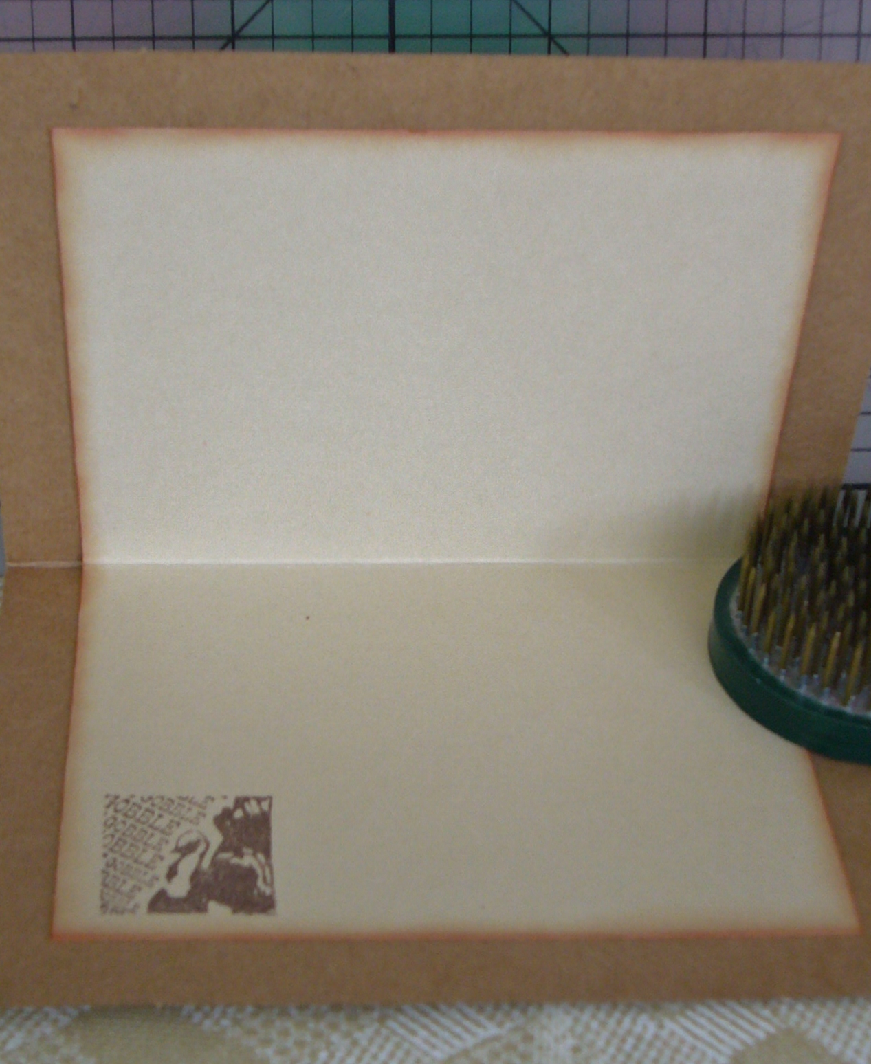
Here is the inside.  I thought I knew where the sentiment came from, but I couldn't find it (maybe Gina K. Designs)  to tell you for sure.  I thought it was a perfect match for the theme of my card.  Added Oct 2, 2012- FOUND IT:  Pink By Design 'live life creatively' set.


The current challenge, PC20, uses an image from Priscilla Styles.  It's a cute Halloween design featuring a frustrated-looking kitty wearing a bat mask.  I did the coloring with various markers.


Once again, I printed my own sentiment.  I added a spider to the original image, and used embossing on the spider and the mask. I know they look gold, but that's just the reflection of the light. Take a look at the next photo.  I was careful not to get the glare.


Here is a look at the inside:


I thought it would be fun to use a stamp of a scarey kitty before it got too pooped.  The card base is cut to A2 size from black card stock from Recollections.

Thanks for coming by to visit today.  See you again soon!

BIG HUGS,

CHRISTINE

Tuesday, September 25, 2012

A Dark and Creepy Night

Oh, yes, it's definitely getting to be that time of year.  I just wish the years didn't turn around so fast.  Thank you for stopping by today, and welcome if you're a new visitor from the Card A Day Blog.  As you may have guessed I am today's designer for the CADB where our theme for the week is Halloween.  It was really fun putting my card together, except that I was having a little difficulty getting the pieces all cut with my Cricut.  Otherwise, there would have been a nice 'creepy' sentiment on the front.  I'll just have to figure that out later.  In the meantime, how about some pictures?


I started with a 6x6" card base to fit all the elements that I planned to use.  The front is another 6x6" piece layered onto the base.  Most of the pieces were cut from the Cricut "A Frightful Affair" cartridge.  I needed the larger card base because the pieces needed to be cut a bit large to get in the details.


The ground is torn black paper layered on a shadow of purple.  The tree is layered on purple as well.  Can you guess what the moon is made from?  Stay tuned to the end if you want the answer.

The next picture is a close-up of the scene around the base of the tree.  We have some scary jack-o-lanterns, a very creepy hand coming up out of the ground, and a few rats scurrying about looking for something they can snack on.  All the pieces have been inked a bit with some silvery ink to show that they are picking up the glow of the bright moon.


I hope you're able to see the layering on this card.  The pieces were all affixed with different thicknesses of foam tape.Here, finally, is the full front view:


On a couple of the photos you can get a peek at the inside of the card, which is just the reverse side of the double-sided card base paper that I used.  It puts me in mind of a dense green woodsy scene with just a bit of light showing through.

Small details:
          Papers:  Coredinations purple, Glitz Design 'Hallow Flames', Papertrey 'Pure Poppy', Recollections black
          Inks:  Studio g VP0015 (a glittery silver chalk ink) and VP0017 (white)

I hope you have some fun making a few Halloween cards this year.  I think they are some of my favorite cards to design and make.

Oh, were you able to guess?  The moon is cut from the inner seal of a jar of peanut butter!  What kinds of things can you come up with to use in unexpected ways?

See you again soon and remember to always keep your creative genius happy and well-fed!!

CHRISTINE

Monday, September 17, 2012

Love Is in the Air

Well, I never promised you a rose garden (Who remembers that song?), but I did promise you a wedding card, and it even has a nice flower on it, though it isn't a rose.  I have lots of pictures for you, so I won't talk too much except for a few details.  I made this card in the standard A2 (4 1/4 x 5 1/2) size.  However, because of the dimension I had to make a special 'envelope box' for the card.

So, how about some photos.........


I just love the soft colors in these papers.  They might look a bit washed out in the photos, but the card looks really lovely in person.
 
Here's the inside:


Since the card front was so busy I decided to keep the inside very clean.  I thought I remembered some wedding related stickers in a pad I got from my sister, and, sure enough, there were some.  The colors in the sticker matched the paper beautifully.

You can see all the dimension in the next two photos.


The last pictures show the box I made for this card.  If I were mailing the card it would need a much sturdier box.  Since it was hand-delivered, a box made with card stock worked out just fine.


The bride is a very crafty young lady, and I know she will appreciate the handiwork in this card.  I hope you enjoyed it as well.  I'd love a comment to let me know you were here.

See you again soon!!

Supplies:
          Paper:  Kaisercraft 'Pink Gelato' 6 1/2" Pad (also sentiment tag), Stampin' Up 'Whisper White'
          Dies:  Die-namics 'Leafy Flourish', Sizzix 'Flowers, Branches and Leaves' set and Tim Holtz 'Tattered Florals', Spellbinders 'Fancy Tags Three'
          Sentiment Sticker:  K & Company Beyond Postmarks 'All Occasion 2 Card Quotables'
          Embellishments:  August Moon 'Pearl Combo'


Please remember to keep your creative genius happy and well-fed.

CHRISTINE

Friday, September 14, 2012

It's Harvest Time

Hi!!  Yes, I know I promised you a wedding card, and I'll post it for you in a few days.  But, for now, it's Canadian Thanksgiving time over at the Card A Day Blog.  It seems our lovely northern neighbors celebrate Thanksgiving in much the same way and for pretty much the same reasons we do in the States.  They just celebrate a little earlier, in October.  So, for all your Canadian friends, here's a nice design for you.  I've used the pretty colors of harvest time, but know that you can easily adapt the design for any use.  Here is your first look:


Surprise!!!  I'm starting with the inside.  (I know, how backward of me. heehee)  First off, I want to say that this card was made TOTALLY of scraps -- even the card base is a refashioned kraft card, just turned to the reverse side.  Being a little dark to write on - and to cover what had been stamped previously, it needed a liner for a message and signature.  I inked the edges of the liner to bring in some color from the card front, and gave it a little turkey stamp in the corner for fun.

The next three photos are close-ups of the central images on the front of the card, shown left, right and center.


I used different colors on which to stamp each image, but I used the same ink as well as the same color to frame each one.  The two side images were mounted with thin foam tape, and the center image was mounted using slightly thicker foam squares to bring it up just a little higher.  These pieces were affixed to another layer of kraft card which was punched top and bottom with a lacy design.

The final piece of the puzzle is the design paper used for the front of the card.  Here is an angled shot which shows the layering.


All that's left to show you is the straight-on photo of my card.  You will see that the design paper was cut to leave just a tiny margin of the card base, and the lacy layer fits to the side edges of the base.


I had thought to use the brighter yellow paper for the centerpiece; unfortunately, the scrap was just a bit smaller than I needed.  Cest la vie!  I'm making the best use of what I have -- it's all part of the fun.  Why don't you challenge yourself to make a card only of scraps, using one of our themes at the CADB, and enter our monthly challenge for prizes?

Thanks for taking the time to visit today.  Here are the little details:

          Stamps:  Inkadinkado 'Harvest Inchie Bundle'
          Inks:  Memento 'Rich Cocoa,' 'Potter's Clay' and 'Desert Sand'
          Punches:  Stampin' Up 'Stamp' and Martha Stewart 'Lacy Edge'
          Design Paper:  K and Company

Here's to keeping your creative genius happy and well-fed!  (Don't forget the chocolate!)

CHRISTINE

Thursday, September 6, 2012

A Golden Autumn

HOW CAN IT BE SEPTEMBER ALREADY???????

Sorry for yelling.  I just can't believe how quickly this year is going.  Even the long, hot summer is over, and all-too-soon we will be seeing the colors of Autumn.  I have another Card A Day Blog design for you today.  As you might already have guessed, our weekly theme is 'Autumn.'  I had several ideas percolating in my brain for this theme, but I love tone-on-tone treatments, so that is the idea that won over all the others.

I started with a base of kraft card stock cut at 4 1/4" x 11" or half an 8 1/2 x 11 sheet cut the long way to make a tall A2 standard sized card.  That piece then needed to be scored and cut to make a step card with one step and a higher centerpiece.  Here is your first view:


The cuts were made 1" from each long side and cut from 1" to 6 1/2".  The center score was done at 5 1/2" and the side scores were made at 1", 2" and 6 1/2".  I really like how the center lifts from the borders.
 
The side border pieces as well as the sentiment piece were cut from a golden paper which has a pretty sheen that, unfortunately, does not show up well in the photos.  The centerpiece was cut from a sandy colored paper, and the mat from a darker mustard paper.  By the way, these pieces were all scraps and I no longer remember where they came from.
 
I used Versamark to stamp the center image as well as the borders and greeting, and used a lovely golden embossing powder to highlight them.


Overall, this was a fairly quick and easy card to make and would be great when multiples are needed.  It's a super design for any occasion.


Not too many extra details for you on this one.  The stamps all came from TPC Studio:  Autumn Harvest set and Patterned Borders.  The embossing powder I used (and I really love this one) is Medieval Metals from Sweet Stamps.
 
Now I'm off to make a wedding card.  I'll show it to you soon after the wedding which is this coming Saturday -- eek! only a couple of days away.  I'd better get creating......................
 
 
Do remember to always keep your creative genius happy and well-fed!
 
Big HUGS to all!!
CHRISTINE