Followers

Thursday, December 13, 2012

Gift Card to Die For

As we get ready to close out our year of cardmaking at the Card A Day Blog, I get to bring you one last inspiration.  Our final theme of the year is 'Snow.'  I had all sorts of ideas, but at the last minute I received a die that I had ordered, so I decided to use it for my card.  I also had been making rosettes to use as tags on Christmas gifts, and it became a simple matter to combine the two elements.

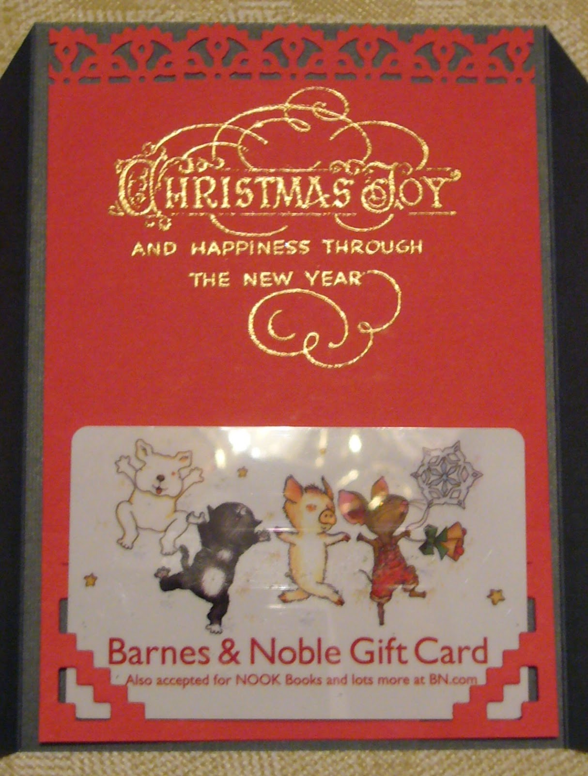
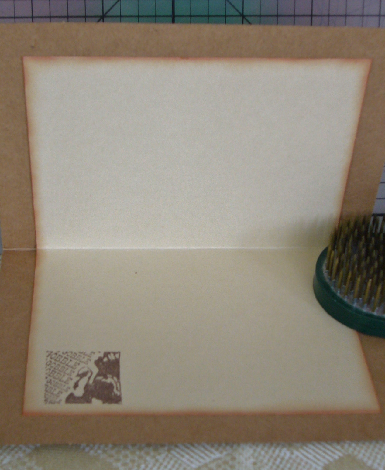
My new die is for a gift card holder.  I chose a paper to coordinate with one of my rosettes, and used the die to cut it out.  I scored for the folds (the scores were lightly marked by the die), and affixed the flap for the gift card.  My last step for the card, itself, was to stamp and emboss a greeting for the inside.  Here are some shots of the inside of the card:


Sorry about the glare in the top photo.  I wanted to show the card as it would be used so I inserted a used gift card into the pocket.  Also, I wanted to emphasize the snow idea on the inside, and used a snowflake stamp along with a greeting to accomplish that.  It also helps to have snowflakes on the card stock that I used.

The rosette I chose was made using another die, the Snowflake Rosette by Tim Holtz.  The paper for that piece also has a snowflake pattern on the red ground.  The scores for the rosette are done as perforations which makes it a bit fiddly to work with, as well as exposing the paper edges.  In this case the edges were showing too much white, so I simply inked those edges to smooth out the color.  I also applied a glitter spray, and added a rhinestone to the center of the snowflake.  I then affixed the snowflake/rosette to the front of the card with foam tape to lift it a bit off the surface making it easier to open/close the flap.

I have three more photos for you.  The first one shows the open card:


The next two give you a much better look at the rosette.  If you click on the pictures you might even be able to see the glitter on the rosette as well as the card itself.


Thank you so much for taking time out of your busy day to visit.  It's such a bustling time for everyone with the holidays looming.  Don't forget to take time for the really important things.

And here are the small details:
     Dies:  Sizzix BigzXL Gift Card Holder and Tim Holtz Snowflake Rosette
     Paper:  Recollections "Jolly Jamboree" stack
     Stamps:  Close to My Heart "Very Merry Christmas" and My Mind's Eye "Holly Jolly"
     Bling:  Studio18 Rhinestones and Crafter's Companion Spray & Sparkle Gold
     Ink:  Versamark
     Embossing Powder:  Stampendous Detail Gold


Hugs to all!
CHRISTINE

Saturday, December 1, 2012

Sharing Joy

Hello Friends!

It's time to share another design that I've made for the Card A Day Blog.  I'm rounding off a week of Holiday Thank You cards, and I wanted my design to still look like Christmas, but perhaps be a little less obvious.  As I've mentioned before (and haven't shared with you YET) I've been working on some projects with a troop of Girl Scouts.  Because of this I have even more scraps than usual, so I wanted to be sure to use some of those scraps for my card.  Don't want to break with tradition, now, do we?  (lol) 

For my design, I started with a 5" x 4 1/4" card base.  Yes, even this was a leftover.  We had cut lots of card bases, and this one turned out to be just a bit smaller that it should have been.  Well, I wasn't going to let it go to waste, was I?!

 I had decided to create a simple background with some stamps using the stamp-off method because I didn't want the color to be too vibrant, kind of like the holiday season fading into memory.  I went hunting through my stamps and found just exactly what I needed.  I also came up with the perfect greeting for the card front.  Once I had those elements I needed a way to 'frame' them, and remembered some leftover pieces from cutting rosettes that I had decided to keep for possible borders.  I had quite a few from which to choose, so I decided on red because I wanted to use traditional Christmas colors and already had green, silver and blue (along with a little gingerbread brown).  Here is your first look:


I stamped the design images directly on the card base after first stamping off on a piece of scrap paper to remove some of the ink.  I chose stamps that were representative of the season without necessarily being too overt.  The borders are the cast-off pieces of some die-cut rosettes that are shaped like snowflakes.  I roughed up the edges to lift them a bit off the card.  The greeting was stamped on a piece of white card which I inked around the edges and  then mounted with foam squares.  The next three photos are closer shots of the different areas of the card.


I know the greeting doesn't look too clear in the photo.  It reads, "The true joy of the season is in the love shared with family and friends."  I wanted to reflect that greeting in my sentiment on the inside.


I created the sentiment in MS Word.  I was happy to find a font that matched the stamped greeting fairly well.  I chose to print the sentiment in red to match the remaining 'border' piece that I wanted to use.  I think it worked out quite nicely.

Here is your full view of the front of the card:


It's a rather simple card, but I think it's actually one of my favorites of my recent cards.  I hope you've enjoyed it, too.

Now for those little details:
  Stamps:  Greeting from Great Impressions, Images from Craft Smart (Michael's)
  Inks:  Martha Stewart 'Sterling Metallic," Ranger Distress "Pine Needles" and "Vintage Photo" and Tsukineko Brilliance "Pearlescent Sky Blue"
  Border:  Leftover cuts from Sizzix Alterations "Snowflake Rosette"
  Paper:  Recollections "Jolly Jamboree" and generic white card stock

Once again, I am honored by your visit, and I thank you.  It's really fun for me to be able to share my creations with you.

Until next time.....

BIG HUGS!
CHRISTINE

Sunday, November 18, 2012

Festival of Lights

As designer of the day for the Card A Day Blog I had the pleasure of creating, for the first time ever, a card for Hanukkah.  This is the first time we've had a week featuring this well-known Jewish holiday at the CADB, and it's been a true learning experience for most of our participating designers.  I know that Hanukkah, or the Festival of Lights, celebrates the miracle of one days' worth of the special olive oil (that remained after the rest had been destroyed) keeping the candles lit in the Temple for a full eight days until a fresh supply could be made.  Not traditionally a religious holiday Hanukkah, falling during the same season as the Christmas holiday, has come to be celebrated in a similar fashion with celebrations, special foods and gift-giving.

My card features the Star of David and the menorah, or candelabrum, on which one candle is lit for each of the 8 days of the holiday.  The center, or highest, candle is the one used for lighting all the others.  Please remember I am speaking as a Christian who is not too well-versed on the traditions, and giving a much condensed explanation.  So, if you need to set me straight in any way, feel free to do so in a comment.  Here is your first look at my card:

 
 I started with a card base cut at 8 1/2" x 5 1/2" in a dark navy and folded in half to form an A2 sized card..  I added a lighter blue mat measuring 4" x 5 1/4" and then the card face, in white, cut at 3 3/4" x 5".  I used two stamps for the greeting, one a background frame stamped in blue and the second stamped with Versamark and embossed in silver.  I couldn't find a stamp of just the word 'Blessings' in my excessive collection (How crazy is that, right?!), so I used 'Autumn Blessing' and taped over the word autumn.  The menorah is a sticker, and the stars are die cuts, the larger one being affixed with foam dots for dimension. 
 
Before the layers were affixed I rounded opposing corners of each layer for a little interest.  I used my tape runner for the blue layer and more foam dots for the white layer.  The rhinestones were added for a bit of sparkle.  Here is another photo where you might be able to see some of the dimension:

 
 I added a white liner to the inside, and created my own sentiment using MS Word.  I thought the bright white pieces were a little too stark, so I inked all their edges letting some of the ink stray toward the center.  Finally, I added two more candle stickers to dress it up.


 I'll end with one more slightly closer shot of the card front, and I'll be looking forward to your comments.


Here are the details:
     Stamps:  Clear Stamps "Faithful Friend" set, TCP Studio "Autumn Harvest" set
     Inks:  Versamark, Stampin' Up "Bashful Blue"
     Papers:  Gina K. Designs "In the Navy", Recollections medium blue, and Georgia Pacific white
     Hanukkah images:  Creative Memories "Judaic Combination Pack"
     Embossing Powder:  Stampendous Metallic Detail Silver


So happy you decided to stop by!  Sending lots of hugs!!!
CHRISTINE

Sunday, November 4, 2012

A Bit of Christmas Joy

Yes, I know, it's only the beginning of November, but Christmas will be here before we know it.  I have the Card A Day Blog spot today, and I am beginning the new theme of 'Christmas Gift Card.'  I think my card has a very traditional look to it with the red and green colors and the holly design paper, and I gave it just a little touch of sparkle to spice it up, as well as a coordinating envelope.

The base is 12" x 5 1/2" and, when folded, creates a card that fits a standard A2 envelope.  It's best to used a two-sided paper for the base to give a more finished look once it's put together.  The base is folded in thirds with the two side sections being cut to form triangles that cross over.  Here's a first look for you:


As you can see, I started with a dark green base (DCWV Textured Naturals), and added triangles of the holly design paper (Recollections Jolly Jamboree).  The insert, as well as the snowflake embellishment, are also from Recollections paper (Bright Christmas pack).  I used a glitter pen to outline the snowflake and draw the faux stitching around the dp.
 
I used coordinating Martha Stewart punches for the insert trim and the snowflake.  Then I used a die to cut notches at the bottom of the insert.  You can see that here:
 
 
The next photo shows a gift card inserted in the cut outs.  The photo below it gives you a nice look at the embossed greeting.


And then one more shot to give you a full view of the opened card:

 
I mentioned that this card has a coordinating envelope.  I used the same punch on the envelope flap that I used on the top of the card insert. It was a combination of a border punch with it's matching corner punch.  Here is a look at the card with its envelope:
 
 
That pretty much wraps it up for this one.  The last photo shows most of the supplies I used in addition to the papers already mentioned.  I used  my ATG to affix the pieces except for the snowflake for which I used a Zig 2-Way Glue Pen.


I hope you've enjoyed your visit with me today.  You might be able to use this card idea for some of your upcoming holiday gift-giving.

I'm still trying to get photos together of the Girl Scout projects I mentioned in an earlier post.  I'll do that soon so you can see what we've been up to recently.

Wishing you a beautiful day,
CHRISTINE

Monday, October 22, 2012

"There's always something...

...for which to be thankful." - Charles Dickens

Well said, Mr. Dickens.  And, this week, the Card A Day Blog is featuring Thanksgiving as our creative inspiration for you.  My card happens to be a card I made last year (I think) which never made it into my blog.  Of course I had every intention of making a brand new card for you, but time truly got away from me.  I know we all understand how that can happen sometimes.

This card was made entirely from Stampin' Up products in the standard A2 size.  The image piece and insert were cut from Very Vanilla, but I don't remember the names of the other paper colors.  The mat was cut at 5 1/4" x 4" and finished with a decorative corner punch, and the image and it's mat were cut at approximately 3 5/8" x 2 3/8" with the image piece just slightly smaller.  The center image is affixed with foam tape.  Here is the front of the card:


The inside sentiment (our quote from Mr. Dickens) was stamped on the Very Vanilla, cut out with a Spellbinders Deckled Edge Rectangle, inked around the edges and affixed.  The inside image was stamped just for a little extra 'something.'  The first photo came out a bit blurred, but here it is anyway so you can see the spacing.:


Here is a nice clear shot of the inside sentiment:


That's about it for now.  Thanks for coming to visit.  I'll be back soon to show you a few things I've been working on with some Girl Scouts!

Big Hugs,
CHRISTINE


Sunday, October 7, 2012

Chickadee and Holly

Greetings!  I hope everyone had a fun time browsing lots of cardmaking blogs yesterday to celebrate World Cardmaking Day.  There is so much talent out there, isn't there!?!  I have a card for you today to open a week of Christmas and Animals at the Card A Day Blog.  From my title you probably guessed the central images on my card.  Here's your first look:


I used a set from Stampin' Up called 'Beautiful Season.'  I wanted to keep the card fairly simple because it is one of a set of cards I designed for some Girl Scouts to reproduce in a series of workshops.  So the image of the Chickadee in the Holly Branch was stamped with no added coloring, but just a little inking around the edges for a slightly aged look.

In the next photo you can see the sentiment and a close-up of the banner piece which was embossed using a Cuttlebug folder in a design that echoes the holly of the central image.


The banner, as well as the card base and the design papers were inked a bit just like the main image piece.  The inside of the card was left very clean, with only the sentiment stamped.


I love this sentiment.  I think it can be used for many styles of Christmas and other holiday season cards.

In the last photo you can see the full front, with a good look at the design papers I used.  I think it's a good-looking card, but still easy enough to make for inexperienced young card-makers.


Just for the sake of clarification, the red is simply background; it's not part of the card.  (In case you were wondering.)  This card fits a standard A2 sized envelope.

Hope you like today's little card.  Here are (most of) the details:
          Papers:  Stampin' Up, K and Company
          Inks:  Memento 'Rich Cocoa', Tim Holtz Distress 'Antique Linen'
          Stamps:  Stampin' Up set 'Beautiful Season'
          Corner Punch:  Tonic
          Embossing Folder:  Cuttlebug 'Holly Ribbon'

Thanks for visiting!!  See you again soon.

Big Hugs,
CHRISTINE

Sunday, September 30, 2012

CDAC Challenge Series

Happy Fall, everyone!!

I have two very different cards for you today.  We recently started a new Progressive Challenge series at the Crafter's Digital Arts Center, and I'm already behind in showing my cards to you.  If you're not familiar with these challenges, do be sure to click on the link and check out the site.  There are lots of fun activities for digital artists.  In the Progressive Challenge Group, we are currently on challenge 20, but I will show you the card for challenge 19 first.

Since summer was coming to an end, our challenge leader wanted to celebrate the summer season.  We had a fun surfboard digi image from Tiffany Doodles.  I hope you like what I've done with it; I turned mine into a 'feel better' card.


I decided to keep the card fairly simple and used coordinating design papers to paper-piece the surfboards, and I used a 'sandy' colored paper with a bit of inking to add a little dimension and shadow.  I made up the the outside sentiment, printed it and affixed it with foam tape putting a bit of curl into it for fun.
 
Here is the inside.  I thought I knew where the sentiment came from, but I couldn't find it (maybe Gina K. Designs)  to tell you for sure.  I thought it was a perfect match for the theme of my card.  Added Oct 2, 2012- FOUND IT:  Pink By Design 'live life creatively' set.


The current challenge, PC20, uses an image from Priscilla Styles.  It's a cute Halloween design featuring a frustrated-looking kitty wearing a bat mask.  I did the coloring with various markers.


Once again, I printed my own sentiment.  I added a spider to the original image, and used embossing on the spider and the mask. I know they look gold, but that's just the reflection of the light. Take a look at the next photo.  I was careful not to get the glare.


Here is a look at the inside:


I thought it would be fun to use a stamp of a scarey kitty before it got too pooped.  The card base is cut to A2 size from black card stock from Recollections.

Thanks for coming by to visit today.  See you again soon!

BIG HUGS,

CHRISTINE

Tuesday, September 25, 2012

A Dark and Creepy Night

Oh, yes, it's definitely getting to be that time of year.  I just wish the years didn't turn around so fast.  Thank you for stopping by today, and welcome if you're a new visitor from the Card A Day Blog.  As you may have guessed I am today's designer for the CADB where our theme for the week is Halloween.  It was really fun putting my card together, except that I was having a little difficulty getting the pieces all cut with my Cricut.  Otherwise, there would have been a nice 'creepy' sentiment on the front.  I'll just have to figure that out later.  In the meantime, how about some pictures?


I started with a 6x6" card base to fit all the elements that I planned to use.  The front is another 6x6" piece layered onto the base.  Most of the pieces were cut from the Cricut "A Frightful Affair" cartridge.  I needed the larger card base because the pieces needed to be cut a bit large to get in the details.


The ground is torn black paper layered on a shadow of purple.  The tree is layered on purple as well.  Can you guess what the moon is made from?  Stay tuned to the end if you want the answer.

The next picture is a close-up of the scene around the base of the tree.  We have some scary jack-o-lanterns, a very creepy hand coming up out of the ground, and a few rats scurrying about looking for something they can snack on.  All the pieces have been inked a bit with some silvery ink to show that they are picking up the glow of the bright moon.


I hope you're able to see the layering on this card.  The pieces were all affixed with different thicknesses of foam tape.Here, finally, is the full front view:


On a couple of the photos you can get a peek at the inside of the card, which is just the reverse side of the double-sided card base paper that I used.  It puts me in mind of a dense green woodsy scene with just a bit of light showing through.

Small details:
          Papers:  Coredinations purple, Glitz Design 'Hallow Flames', Papertrey 'Pure Poppy', Recollections black
          Inks:  Studio g VP0015 (a glittery silver chalk ink) and VP0017 (white)

I hope you have some fun making a few Halloween cards this year.  I think they are some of my favorite cards to design and make.

Oh, were you able to guess?  The moon is cut from the inner seal of a jar of peanut butter!  What kinds of things can you come up with to use in unexpected ways?

See you again soon and remember to always keep your creative genius happy and well-fed!!

CHRISTINE

Monday, September 17, 2012

Love Is in the Air

Well, I never promised you a rose garden (Who remembers that song?), but I did promise you a wedding card, and it even has a nice flower on it, though it isn't a rose.  I have lots of pictures for you, so I won't talk too much except for a few details.  I made this card in the standard A2 (4 1/4 x 5 1/2) size.  However, because of the dimension I had to make a special 'envelope box' for the card.

So, how about some photos.........


I just love the soft colors in these papers.  They might look a bit washed out in the photos, but the card looks really lovely in person.
 
Here's the inside:


Since the card front was so busy I decided to keep the inside very clean.  I thought I remembered some wedding related stickers in a pad I got from my sister, and, sure enough, there were some.  The colors in the sticker matched the paper beautifully.

You can see all the dimension in the next two photos.


The last pictures show the box I made for this card.  If I were mailing the card it would need a much sturdier box.  Since it was hand-delivered, a box made with card stock worked out just fine.


The bride is a very crafty young lady, and I know she will appreciate the handiwork in this card.  I hope you enjoyed it as well.  I'd love a comment to let me know you were here.

See you again soon!!

Supplies:
          Paper:  Kaisercraft 'Pink Gelato' 6 1/2" Pad (also sentiment tag), Stampin' Up 'Whisper White'
          Dies:  Die-namics 'Leafy Flourish', Sizzix 'Flowers, Branches and Leaves' set and Tim Holtz 'Tattered Florals', Spellbinders 'Fancy Tags Three'
          Sentiment Sticker:  K & Company Beyond Postmarks 'All Occasion 2 Card Quotables'
          Embellishments:  August Moon 'Pearl Combo'


Please remember to keep your creative genius happy and well-fed.

CHRISTINE

Friday, September 14, 2012

It's Harvest Time

Hi!!  Yes, I know I promised you a wedding card, and I'll post it for you in a few days.  But, for now, it's Canadian Thanksgiving time over at the Card A Day Blog.  It seems our lovely northern neighbors celebrate Thanksgiving in much the same way and for pretty much the same reasons we do in the States.  They just celebrate a little earlier, in October.  So, for all your Canadian friends, here's a nice design for you.  I've used the pretty colors of harvest time, but know that you can easily adapt the design for any use.  Here is your first look:


Surprise!!!  I'm starting with the inside.  (I know, how backward of me. heehee)  First off, I want to say that this card was made TOTALLY of scraps -- even the card base is a refashioned kraft card, just turned to the reverse side.  Being a little dark to write on - and to cover what had been stamped previously, it needed a liner for a message and signature.  I inked the edges of the liner to bring in some color from the card front, and gave it a little turkey stamp in the corner for fun.

The next three photos are close-ups of the central images on the front of the card, shown left, right and center.


I used different colors on which to stamp each image, but I used the same ink as well as the same color to frame each one.  The two side images were mounted with thin foam tape, and the center image was mounted using slightly thicker foam squares to bring it up just a little higher.  These pieces were affixed to another layer of kraft card which was punched top and bottom with a lacy design.

The final piece of the puzzle is the design paper used for the front of the card.  Here is an angled shot which shows the layering.


All that's left to show you is the straight-on photo of my card.  You will see that the design paper was cut to leave just a tiny margin of the card base, and the lacy layer fits to the side edges of the base.


I had thought to use the brighter yellow paper for the centerpiece; unfortunately, the scrap was just a bit smaller than I needed.  Cest la vie!  I'm making the best use of what I have -- it's all part of the fun.  Why don't you challenge yourself to make a card only of scraps, using one of our themes at the CADB, and enter our monthly challenge for prizes?

Thanks for taking the time to visit today.  Here are the little details:

          Stamps:  Inkadinkado 'Harvest Inchie Bundle'
          Inks:  Memento 'Rich Cocoa,' 'Potter's Clay' and 'Desert Sand'
          Punches:  Stampin' Up 'Stamp' and Martha Stewart 'Lacy Edge'
          Design Paper:  K and Company

Here's to keeping your creative genius happy and well-fed!  (Don't forget the chocolate!)

CHRISTINE